Line Graph vs. Bar Chart: Choosing the Right Visualization for Your Data
Introduction
Data visualization is a powerful tool for conveying complex information in a clear and accessible manner. When it comes to visualizing quantitative data, two popular choices are line graphs and bar charts. Both these visualizations have unique characteristics and serve different purposes. In this article, we will explore the differences between line graphs and bar charts, and when to use each type of visualization based on the nature of your data and your communication objectives.
Line Graphs: Description and Usage
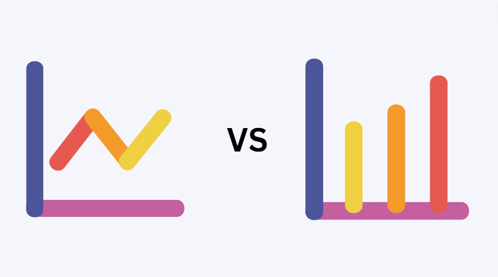
A line graph is a graphical representation of data points connected by straight lines. It is primarily used to show trends, patterns, and changes in data over time. The x-axis represents the time or continuous variable, while the y-axis represents the values or measurements. Line graphs are well-suited for displaying time-series data or data with a logical progression.
- Showing Trends Over Time: Line graphs are ideal for presenting data that changes continuously over a period, such as stock prices, temperature variations, or population growth.
- Identifying Patterns and Seasonal Trends: Line graphs can reveal patterns, cycles, and seasonal fluctuations, making them useful for understanding recurring trends in the data.
- Comparing Multiple Time-Series: When you want to compare trends in multiple datasets side-by-side, line graphs offer a clear visualization of the relationships between the datasets.
Bar Charts: Description and Usage
A bar chart represents data using rectangular bars of varying lengths or heights. The length or height of each bar is proportional to the values it represents. Bar charts are commonly used to compare categories or discrete data points, and they are effective in displaying data with distinct categories.
- Comparing Categories: Bar charts are excellent for comparing values between different categories or groups, such as sales of different products, survey responses by demographics, or student performance by grade.
- Displaying Discrete Data: When dealing with data that does not have a continuous progression, bar charts present discrete data points in a visually clear and concise manner.
- Highlighting Differences: Bar charts emphasize the differences between data points, making them valuable for illustrating disparities and rankings.
Choosing the Right Visualization:
Consider the type of data you have. For time-series or continuous data, a line graph is usually more appropriate, as it showcases trends and changes over time. On the other hand, for discrete or categorical data, a bar chart is more suitable, as it allows for easy comparison between different categories.
Think about the message you want to convey and the objectives of your visualization. If you want to show a progression or trend, a line graph is likely the best choice. If your goal is to compare values or highlight differences, a bar chart would be more effective.
Consider the complexity of your data. Line graphs work well for data with many data points and continuous trends. Bar charts are better suited for data with distinct categories and straightforward comparisons.
Conclusion:
In summary, line graphs and bar charts are both valuable tools in the data visualization toolkit, each with its unique strengths. Line graphs are ideal for showing trends and changes over time, while bar charts are excellent for comparing discrete data points or categories. The choice between these visualizations depends on the nature of your data and the message you wish to convey. By selecting the appropriate visualization method, you can effectively communicate insights and make data-driven decisions with clarity and precision.