Which Data Would Be Suitable for Line Graphs? - A Comprehensive Guide
Introduction
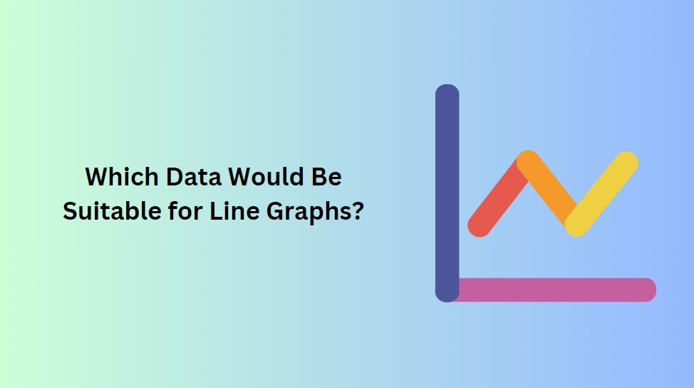
Data visualization is an essential tool for understanding complex information and spotting trends within datasets. Among the various visualization techniques, the line graph stands out as one of the most effective ways to present specific types of data. In this article, we will explore the characteristics of data that are suitable for line graphs and how this visualization method can provide valuable insights into various scenarios.
1. Time-Series Data
Line graphs are most commonly used to represent time-series data. Time-series data is a sequence of data points collected over successive time intervals. It could be hourly, daily, monthly, or yearly data, depending on the context of the analysis. Line graphs excel at illustrating how a particular variable changes over time, allowing viewers to observe trends, patterns, and fluctuations.
Examples of time-series data suitable for line graphs:
- Monthly revenue of a business over several years.
- Daily temperature readings in a city for a specific month.
- Hourly website traffic over the course of a day.
2. Continuous Data:
Line graphs are particularly effective for visualizing continuous data, where values can be measured and recorded at any point along a continuous scale. Continuous data forms an unbroken sequence, making it ideal for representing smooth lines in a line graph.
Examples of continuous data suitable for line graphs:
- Height measurements of a growing plant over time.
- Prices of a commodity over a given period.
- Speed of a vehicle during a journey.
3. Single Variable Comparison:
When you want to compare the changes in a single variable over time or between different groups, line graphs provide a clear and concise visualization. By plotting the data points and connecting them with lines, line graphs allow viewers to easily identify the progression or regression of a specific metric.
Examples of single variable comparisons suitable for line graphs:
- Comparing monthly rainfall in different cities over a year.
- Tracking the population growth of different countries over the past decade.
- Examining the stock prices of various companies over a specified time frame.
4. Highlighting Trends and Patterns:
Line graphs are highly effective in displaying trends, patterns, and variations within data. They help users identify fluctuations and changes in a dataset, making them ideal for identifying recurring events or seasonal patterns.
Examples of highlighting trends and patterns suitable for line graphs:
- Visualizing the number of flu cases during flu seasons each year.
- Displaying website traffic during different times of the day.
- Tracking the price fluctuations of a commodity over multiple years.
Conclusion:
Line graphs are a powerful and versatile tool for visualizing specific types of data, especially time-series and continuous data. Their ability to showcase trends, patterns, and changes over time makes them invaluable in various fields, including finance, climate science, healthcare, and social sciences. When dealing with data that involves time or continuous measurements and requires a clear representation of trends, a line graph is an excellent choice. By leveraging the insights provided by line graphs, we gain a deeper understanding of the dynamics within our datasets, enabling better decision-making and informed analysis.